1989 KX450F Graphics from Englishman!!

Zeke27G
Posts
1237
Joined
11/8/2011
Location
Ascot Park, CA US
Edited Date/Time 5/29/2012 10:00pm
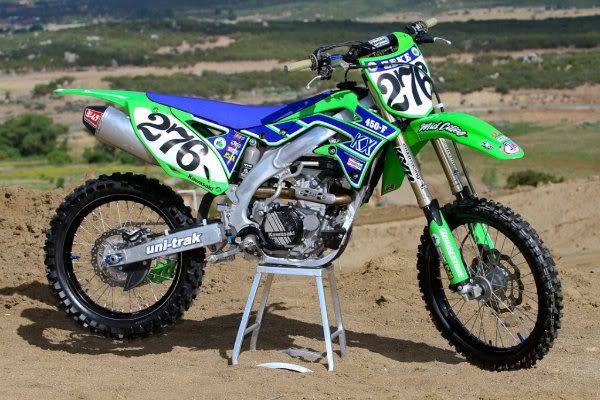
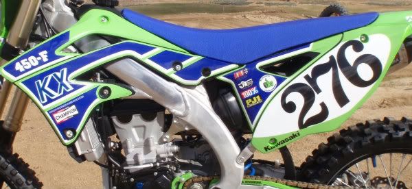
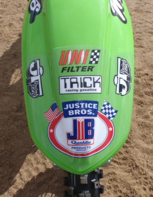
If you guys want some custom graphics done right, you can't go wrong with Sean aka "Englishman"!!

http://lcggraphix.com/

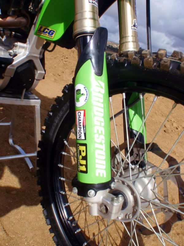
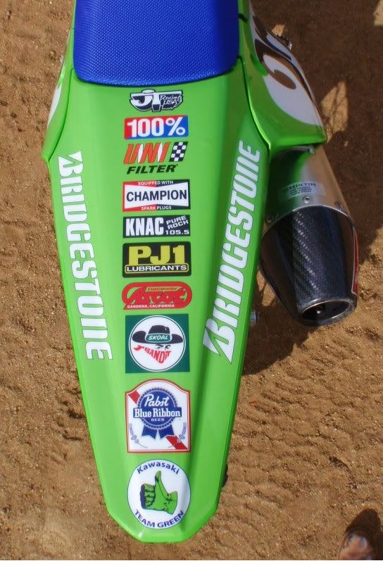
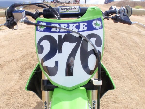
I was looking for someone to make a set of retro style '89 KX graphics for my '12 KX450F and Sean PM'd me and said he could do the job. I told him I wanted all of the sponsor logos to be old skool and that I didn't want anything to look like the typical "energy drink puke graphics" that most companies offer. He knew exactly what I was looking for!! We worked together through several edits to get to a point where I was more than satisfied with the graphics and I am really stoked on how they came out. His pricing was more than reasonable and I'm stoked on the results!!

Sean does a lot more than MX graphics, he can do vehicle wraps and banners...you name it!! Sorry if this sounds like spam, but the dude is the real deal and I'm stoked on what he has done for me!!

Send him a PM and he'll do you right!!

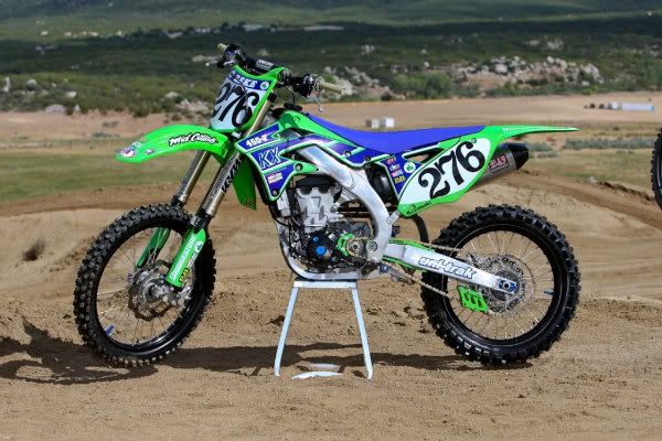
Thanks to Steve Emter for the first two shots!!


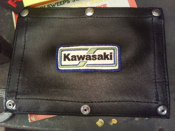
A friend of mine gave me an old Kawasaki patch, so I had to use it when I was having a custom bar pad made from naugahyde!! Haha

On a side note...if you were wondering, we had the graphics dyno'd and they added approximately 7HP and while testing at the track they took 13 seconds off of my lap times.
|
crashnburn
Posts
35
Joined
4/19/2012
Location
Glasgow, MT US
5/28/2012 10:09pm
That is fantastic! Great look in my opinion. I am considering doing something with my KX as well. It was easy to find retro graphics for my last bike, CRF450, no so easy for the new KX.
Crush
Posts
20957
Joined
4/26/2009
Location
Sydney AU
5/28/2012 10:23pm
Looks AMAZING! Good job!!!
kawboy388
Posts
986
Joined
4/2/2008
Location
Covington, TX US
5/28/2012 10:36pm
Looks great,although you went 1979,on the numbers and bar pad.

The Shop

sam111
Posts
419
Joined
2/1/2009
Location
NZ
5/29/2012 12:00am
The look of your bike is both unique and cool. I like the blue and green colour scheme a lot. I'm not sold on the style of the numbers though, but that's just me - maybe I'm not old enough to appreciate them.
A modern styled kit with all green plastics, a blue seat (same shade of blue as your's) and blue/white graphics would look sweet too.
wacker
Posts
197
Joined
8/29/2006
Location
Murrieta, CA US
5/29/2012 2:25am
Very nice. Love the look. Very clean and great details.
scott_nz
Posts
5319
Joined
4/1/2008
Location
NZ
Fantasy
655th
5/29/2012 3:06am
i love the 89 graphics, but i think the tall italic numbers from the era would have been cool as well, agree that they look 70's ish,

i think this is the coolest 2012 i have seen tho
G Force
Posts
1507
Joined
8/15/2006
Location
Winnipeg CA
5/29/2012 3:19am
To really pull off 1989, you needed to replicate 100%, or Dirt Digits numbers. The font you used would have been better suited to 1978 IMO.

Very well done! I think your guy will sell more than a few sets of these!
Zeke27G
Posts
1237
Joined
11/8/2011
Location
Ascot Park, CA US
5/29/2012 5:46am
G Force wrote:
To really pull off 1989, you needed to replicate 100%, or Dirt Digits numbers. The font you used would have been better suited to 1978 IMO...
To really pull off 1989, you needed to replicate 100%, or Dirt Digits numbers. The font you used would have been better suited to 1978 IMO.

Very well done! I think your guy will sell more than a few sets of these!
Yeah we tried those 100%, ZeroNine style of numbers and they aren't much different than what a lot of companies are using for pre-printed background numbers currently. I wanted something that would set the bike apart from the other Joe's and I've got a '74 MX360 with those style numbers so it just seemed fun, like...why the f*ck not?!! Haha
Paul333
Posts
1838
Joined
2/15/2012
Location
Virginia Beach, VA US
5/29/2012 6:54am
Damn awesome.

I love it!
tbanks
Posts
1519
Joined
5/28/2011
Location
Great Mills, MD US
5/29/2012 7:17am
That looks awesome
GrapeApe
Posts
6988
Joined
6/7/2010
Location
Mc Kinney, TX US
Fantasy
760th
5/29/2012 8:18am
Really cool! He did a great job on the graphics making them look '89 without looking awkward on the modern bike like some throwbacks I have seen.

The green/blue JT stuff would look really good with that bike.
bullpen58
Posts
4400
Joined
8/15/2006
Location
Fresno, CA US
5/29/2012 8:27am
Raddest thing I have seen in months. Nice attention to detail with the bar pad cover.

I LOLed at some of your sponsors (skoal, pabst).

I love the old skool numbers. Reminds me of my BMX days.
bullpen58
Posts
4400
Joined
8/15/2006
Location
Fresno, CA US
5/29/2012 8:28am
GrapeApe wrote:
Really cool! He did a great job on the graphics making them look '89 without looking awkward on the modern bike like some throwbacks I have...
Really cool! He did a great job on the graphics making them look '89 without looking awkward on the modern bike like some throwbacks I have seen.

The green/blue JT stuff would look really good with that bike.
I agree about the JT gear.
Wandell
Posts
7563
Joined
12/17/2008
Location
Cairo, GA US
5/29/2012 9:21am
I really like the color/graphics but agree the numbers and bar pad look like they are from the 70's. Would be great if you could find a blue DeBruzer crossbar pad!
5/29/2012 9:38am
Awesome! I'd love to do something similar with mid 90s decals one day. It's cool to see something different.
Zeke27G
Posts
1237
Joined
11/8/2011
Location
Ascot Park, CA US
5/29/2012 7:35pm Edited Date/Time 5/29/2012 7:36pm
For all of you guys who thought the numbers were more '79 than '89, here you go!! We had done an edit with the "zeronine" style numbers. I just didn't feel like they looked as cool as the 70's numbers. I thought they looked too modern. Maybe I'm too old skool?! Haha

Maybe you guys could think of another 80's style number that might be cool?


The bar pad on the other hand...IMO...it's bitchin'!!
bvm111
Posts
9323
Joined
7/1/2008
Location
Las Vegas, NV US
5/29/2012 8:59pm
thats sweet... how can i get a PBR sponsorship!!!!
rohleder644
Posts
1053
Joined
1/18/2011
Location
Lee’s Summit, MO US
5/29/2012 9:21pm
That thing's hideous........not my style. Howeeeever, it's badass! Dude did a really good job. Pumped for you, as it's obvious you're in to it. It doesn't get much cooler than the old team green logo.
jathey
Posts
329
Joined
4/1/2008
Location
MD US
5/29/2012 9:48pm
Very different and cool. Are you going to get some retro-looking riding gear done up to go with it?
Zeke27G
Posts
1237
Joined
11/8/2011
Location
Ascot Park, CA US
5/29/2012 9:50pm
That thing's hideous........not my style. Howeeeever, it's badass! Dude did a really good job. Pumped for you, as it's obvious you're in to it. It doesn't...
That thing's hideous........not my style. Howeeeever, it's badass! Dude did a really good job. Pumped for you, as it's obvious you're in to it. It doesn't get much cooler than the old team green logo.
It may not be everyone's taste....but at least it doesn't have Monster Energy logos all over it. Oh and lets see your bike / graphics buddy...
jeffro503
Posts
27442
Joined
7/22/2007
Location
St Helens, OR US
5/29/2012 10:00pm
That is really cool! You guys did a great job on matching up the retro style!

Post a reply to: 1989 KX450F Graphics from Englishman!!

The Latest